
The Bu Package Design
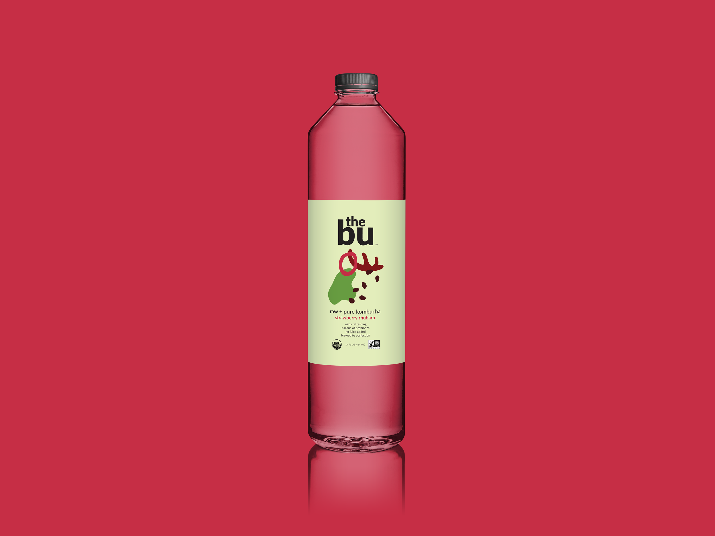
One of my favorite projects was recreating the package design of an existing health product. The Bu Kombucha is a real brand with very sleek and modern packaging. The Bu is mainly marketed towards an active audience. The bottle looks like a sports drink, which is misleading. Although the color palette and font is attractive, the branding does not communicate clearly what Kombucha is. This causes the “raw and natural” message to get lost. My goal was to market The Bu to a wider audience. By creating abstract illustrations inspired by the natural ingredients found in the Kombucha, more people will be curious about the product and want to try it. Additionally, illustrating the ingredients on the label of the product helps demystify what Kombucha is.


